http://24ways.org/2005/transitional-vs-strict-markup
http://www.smashingmagazine.com/2008/11/12/12-principles-for-keeping-your-code-clean/
Thursday, November 13, 2008
Some Links
Saturday, July 12, 2008
Links
To be blogged about in detail later
IE div height problem | Highlight current page. | http://www.websiteoptimization.com/speed/tweak/current/
http://www.dustindiaz.com/min-height-fast-hack/
http://www.webconfs.com/how-to-redirect-a-webpage.php
http://www.positioniseverything.net/abs_relbugs.html - absolute positioning
Tuesday, June 24, 2008
Show active links with CSS and 'includes'
A common practice in web design is to use 'includes' for repeating page elements - such as a navigation bar or a sidebar. I am sure all web application frameworks provide some way of using includes. What I could not figure out was a simple way of highlighting the active link in that include - short of scripting, or not using includes at all.
But then again - I hadn't googled it - and here is a simple, even though not the most elegant way of highlighting the active link: Called the Body ID/Class method.
http://www.websiteoptimization.com/speed/tweak/current/
The idea is to add a separate class to each <body> tag and use a corresponding class or id for the link to that page. For example if I add a class 'home' to the <body> tag on my home page, and an id 'home' to the <a> that links to the page in my navigation include,
I just need to add this CSS rule:
body.home a#home{style declaration}
I agree the addition of an extra class to the body tag may be a bit cumbersome - but if you can maintain separate title tags for all pages - you can also do that for your body tags - just follow some kind of standard naming convention.
The benefits to code brevity and code management are immense.
Image Resizing for Web Use
This probably must be the simplest thing to do for most web designers - but yet so many get it wrong.
Or perhaps, it's incorrect to use the term 'web designers': I think what I should say instead is, because everyone thinks this must be simple to do, even non-designers attempt it and get it wrong in the process.
There are two ways in which I have seen this done wrong:
1] HTML resize of images.
Take an image and enter the modified dimensions in the img tag.
So I would say <img src="" height="50" width="50"/> for proportional resize of a square image. [If you enter only one dimension, the image gets resized proportionally anyway].
The problem with this approach is a) The image is not actually being downsampled and you are making your end user download a much larger quantity of data than what's needed b) Most browsers render this resized image incorrectly (except the extremely smart Safari in my experience). Some examples: The right has been resized in a photo editing program (actually the nifty Windows Live Writer did it by itself).


http://blog.burrp.com/2007/09/03/the-green-blue-bday-bash/
Right click on any image and select 'View Image' you will see that the original images are much larger than as they are shown in the content.
2] Indexed color resize of images.
Several of us actually manage to fire up Photoshop to do a resize, but then end up with really ugly resized versions.
The problem here is that a lot of resizing gets done on logos which are in the .gif format. That means that it has only a specified number of colors allowed (called Indexed color), what needs to be done is to change the mode of the image to RGB before resizing it, subsequent to which it can be saved in the .gif format again.
L-R 1] Original, 2] HTML resize, 3] Photoshop resize in Indexed mode, 4] Photoshop resize in RGB and then saved to index.

Hope this is useful.
Thursday, May 29, 2008
Equal Height Columns
Want to create equal height columns with CSS. Looks like faux columns is the best choice.
http://www.positioniseverything.net/articles/onetruelayout/equalheight
http://www.ejeliot.com/blog/61
Saturday, May 24, 2008
IE6 Blues
Why on earth do 68% of my website visitors use IE/Win?
Anyway, after banging my head around with CSS to get semantic markup to work with IE and a bunch of other things, I have given up for now.
Just bookmarking some pages about the 'hasLayout' property in IE for future review.
http://www.brunildo.org/test/IEABlock.html
http://www.brunildo.org/test/IEABlock1.html
http://www.satzansatz.de/cssd/onhavinglayout.html
An MSDN article on the hasLayout property:
http://msdn.microsoft.com/en-us/library/bb250481.aspx
The Escaping Floats bug:
http://www.positioniseverything.net/explorer/escape-floats.html
The Peekaboo bug (Disappearing text!)
http://www.positioniseverything.net/explorer/peekaboo.html
The Holly hack to fix these (no longer valid because of IE7): Using the mysterious box outside the html tag (who discovered this man!?)
http://www.communitymx.com/content/article.cfm?page=2&cid=C37E0
The new solution for holly hack [by creating that extra container using conditional comments The #IERoot method:
http://www.positioniseverything.net/articles/cc-plus.html
Saturday, April 19, 2008
Vertical-alignment without tables
One of the common problems I come across when creating a picture gallery, is to vertically align images.
Say, I have 4 images, with variable height and width, but fixed max-height and max-width and a title underneath.
I could use
   <div style="float:left; margin-right:10px;">
  <div class="outerbox" style="width:100px; height:100px; border:1px solid #999;">
  <img="src=path" class="innerbox"/>
  </div>
  <div>Title</div>
</div>
I will get an image gallery which looks like this:

Here, if I want to center the images inside the grey box, I just need to add the declaration, text-align:middle, to the container, however, if I want to vertically align these, I have nothing that I can use, short of using tables with a valign attribute. This is because the 'vertical-align' style declaration does not mimic 'valign' in all cases. A detailed analysis of vertical-align by Gary Kistner can be found here.
Initally, I was delighted to see that upon giving the div tag a display property of 'table-cell' it uses it implements like a valign tag. [click to enlarge]
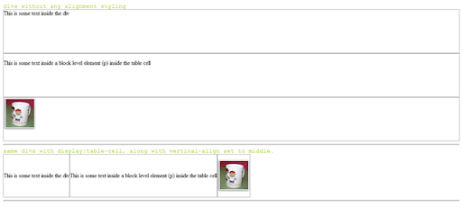
But unfortunately, IE6 does not support this. For a detailed description on how browsers implement the display property, visit this page on quirksmode.
The previous article by Gavin Kistner offers two workarounds.
Method one works in the following way (I call it the Duck and Head-up method): assuming a fixed height for the inner content (im my example the img with class innerbox), position it absolutely inside the container (outerbox) with the top-edge at 50% of the outerbox height. Now move back the innerbox up by half its own height, by using margin-top:-y, (y=half of inner box height).
I haven't tried this, simply because in my case, the inner content does not have a fixed height.
The second may perhaps work because it assumes a single line of text inside the box (which a single inline image should be) and a fixed height for the outerbox, (which is true in my case), and then setting the line-height for the parent (outerbox) to the fixed-height. Let's see how that works. Sadly, it only works in the case of text. probably because it relates to font-size and not image-height [In the following example, text-height + above and below height = 140 which was the specified line-height]

[In the above example, height declaration replaced by line-height declaration]
I came up with a workaround which included some additional mark-up. Add a non-breaking space ( ) before the image, set the font-size to 1px and increase the outer-box width a little; that way the image is seen as a part of the running text and Mozilla and Safari render this correctly [look at the second box]. But as always IE6 refuses to implement it this way! Sigh.

Finally, this site seems to have find a solution using a font-height declaration for IE6 and then hiding it from other browsers. CSS vertical-align.
But clearly if you want an excess mark-up and hack free solution, tables are probably your only resort - at least for an image gallery.
Subscribe to:
Posts (Atom)