Tuesday, September 8, 2009

Wireframing

Making a trip to Smashing Magazine always means an hour if not more of internet browsing. It is amazing how they churn out relevant and interesting content post after post. One of the posts that I came across today was on wireframing and lists several interesting resources on the topic. Wireframing is a topic of interest for me and I came across the following interesting tidbits:

1. The ‘boxing glove’ method: Use Post-It’s for each page as the smaller page size forces you to concentrate on the bigger picture and also anyone can participate.

2. SEO Wireframing: http://www.seomoz.org/ugc/seo-wireframing

Thursday, June 25, 2009

Flunking Flex : Another Random Day

Trying to develop my content in Illustrator and exporting them as symbols to be used as content in the Doodlepad.

Apparently not working because they are being read as AVM1. This isn’t an acceptable solution yet (sigh): http://paulofierro.com/archives/513/

Wednesday, June 10, 2009

Image Spacing in HTML E-mails in Hotmail

This post sums it up pretty well:

http://www.viget.com/inspire/hotmail-image-problems-in-html-emails/

You need to add a ‘display:block’ style attribute to all the images.

Friday, May 22, 2009

Flunking Flex: Day X

Long hiatus (which means things were going okay thus far)

Learnt that containers that support absolute positioning of children do not support the padding attribute.

http://bugs.adobe.com/jira/browse/FLEXDOCS-493

TextArea don’t autosize and one needs ActionScript to achieve that :(

http://blogs.warwick.ac.uk/rbotoole/entry/automatically_resizing_text/


If you’re trying to add a padding to the labels in a TabBar, styling the TabBar styleName won’t work, you need the assign a ‘tabStyleName’ and then apply padding to the labels.

Thursday, May 7, 2009

Flunking Flex : Day 2

1. The bold font weight: Was still struggling with the font-weight issue on a button. The problem was that while the font was being applied to my TabBar after setting the Button font-weight to normal, on the active tab, there was still no text appearing since that was still bold. I finally found a solution but not before trying all kinds of random things – talk about taking the long route.

I set out solving the problem with the Button. Looked through available attributes that I can set through CSS – to no avail. Trying adding a font as an .swf – again to no avail. Then i googled away and found a solution which required editing the Font in a Font Editor and then setting the sub-family to bold. [http://www.gskinner.com/blog/archives/2007/03/bitmap_fonts_in.html] That worked after much trial and error. Finally I decided it was time to post my Flex woes online for the day and realised I was approaching the problem from the wrong end.

I needed to set the font weight on the active tab.

Thus all I needed was adding this to my TabBar CSS declaration: selectedTabTextStyleName:"activeTab"; and then apply a normal weight to the activeTab.

2. What to use for styling?

There are too many ways to do things in Flex – all slightly inflexible. I’m unable to decide if I should use Degrafa, if I should use Illustrator or if I should use Photoshop to create my button skins. Guess, I better take an evolutionary approach to this one – so do the one that does the job right now – and worry about maintainability and size later.

Tuesday, May 5, 2009

Flunking Flex

1. Degrafa (Yay!) Using Degrafa in CSS to specify gradient fills and selectively round corners (makes life incredibly convenient)http://www.mikehuntington.com/?p=31 [Advanced CSS with Degrafa]

2. fontWeight on Button: You embed a font and then apply it to a Button and a Label. It works on the Label but not on the Button. Why so? Perhaps you embedded a normal weight font, but did not specify fontWeight:normal on the Button. Since, the default fontWeight on your button is bold, and your embedded font isn’t, you need to explicitly add fontWeight:normal to your Button style. Damn! hours wasted on this. [http://viconflex.blogspot.com/2006/11/deal-with-embedded-fonts-buttons-and.html] and more hilariously[http://polygeek.com/496_flex_issues-with-embeding-fonts-for-buttons-in-flex]

3. TabBar extends Button: You create a TabBar and gave it a nice new font. It doesn’t work. You scroll through your CSS and see you haven’t declared a style on the TabBar any-fucking-where. After an hour of trying stuff that even you know is inane, and deleting several parts of your CSS – you find a style declaration you had given in the beginning of the project : the Button component. Turns out the TabBar extends the Button component and this style will override a fontFamily applied to the TabBar separately.

4. Disappearing Flex Builder: Flex Builder 3, Project > Properties > Flex Build Path = Empty Screen in Vista x64. http://bugs.adobe.com/jira/browse/FB-12239

5. Hope this isn’t true: “Scale 9. As I wrote about in Introduction to Flex 2, the big difference between skins and background images is that you can use scale 9 on your skins to let one image work in many different sizes without looking awkward. But for whatever reason, and nobody ever tells you this, you can’t use scale 9 with assets embedded from symbols in SWFs. It just doesn’t work. Regardless of whether you build the guides in Flash yourself, or write them in the embed tag. If you want to use scale 9 in your skins, pull them in as PNGs, and use the all-but-hidden embed “grid” attributes:” from [http://dispatchevent.org/roger/flex-3-tips-tricks-and-gotchas-a-series/]. yflexskin.swf seems to work okay – so I’m hopeful.

Friday, April 3, 2009

IA diagrams

A visual vocabulary for describing information architecture and interaction design: http://www.jjg.net/ia/visvocab/

Thursday, April 2, 2009

Lessons in Web Design – ‘dihari baandhna mat bhoolo’

In Indian parlance, dihari is the daily wage you pay a wage worker. That is exactly what we are as web designers and subsequent to some one of my projects not going well, these are some lessons I’ve learnt and would like to share.

1. People don't know what they want. Resist giving a quote until this is figured out in a significant detail.
2. People don't understand why are they being charged as much as they get charged.
3. Don't undersell yourself (Do #2).
4. Disclaimers and scope are more important than you think.
5. A few hours spent earlier will save you spending several hours later.
6. Never start working without an advance.


1. People don't know what they want. 80% of the time people just know that they want a website, but they don't know a) what they want in it b) what they want to achieve with it or c) even what it should look like.

Thus it's very important to help them think through this to simplify your work in the future. Using one of my projects as an example:
a) The number of features needed kept increasing. Music on the home page, a small Javascript tool, additional pages, an 'offer of the month' section etc. Now our obvious reaction is - mat karo, this is not what we had been decided, however, from the client’s perspective, who is starting a new business - and constantly coming up with new ideas this is completely natural. However, if the details had been worked out in the beginning, it would be easy to charge extra for any new features requested later.
b) The number of design iterations were more than 4-5, and were still not approved. Again, by reining in the tendency to design and concentrating on content first would reduce this. A book I read recently (Head First Design), also recommends using a lot of paper before going ahead with an actual mock-up in Photoshop.


2. People don't understand our work. Unfortunately, unlike the print business where a 'unit' is very clear (per sheet, per mug etc.), we guys sell 'hours'. Plus, our hours are spent on various activities: design, converting design to HTML, resizing images, checking if this works across all browsers etc. It is of the utmost importance to tell your client how this process works, because otherwise they will always think that they are being overcharged. Spend some time breaking down the hours that will go into each module of the website, once you're through #1 above. This is true even when you're not charging your customer per hour. Work out the dihari.


3. Don't undersell. You will definitely get a project if you quote less. But the question is, 'Why should you quote less?'. I think the popular wisdom is that 'people buy things that are inexpensive'. The popular wisdom misses one very important element - 'Whose money is it?'. People will always buy something that gives them the maximum value for their money. Thus, if you have #2 covered, you will stop underselling yourself. The notion that your client may have is - 'I can get the same thing done cheaper'. Your answer shouldn't be 'Oh. Okay, I'll do it at that price', it should be 'Sure, you can. And you should.' and then tell them what all they should look out for in this new vendor. Even if you don't get the project, the client should go away thinking that he has learnt something from you (e.g. how to evaluate the next vendor).


4. Disclaimers and scope. After you have worked out the client requirements and said anything more is chargeable, reiterate the point, reiterate the extra hours you will put in if the requirements change. Keep it transparent - and your life will be easy.


5. Hours saved. Again, if I had done #1,#2,#3 and #4, we would not have spent additional hours on the mentioned project, and when I woud’ve, I would have charged money for it.


6. Money in advance. I started working on two projects after a verbal commitment. This was mostly because I thought that we didn't have a body of work in website development and so the first bit of work, e.g. the design mock-up would convince the client that we mean business, that the project is on and they would be confident about our capability to finish the project. It was a way of giving the client a sample piece of work so that they 'buy-in'.

I still say 'do something so that the customer buys-in'. But let that be #1 above. You have helped your client figure out what they want - and that's good enough - you have already given them a service. If they need more, ask them to pay up first.

Don't be embarrassed about asking for money (as long as you have #2 covered, that'd never be a problem) – this in fact (to not be embarrassed) is an important person lesson for me.


Tuesday, March 31, 2009

Black Border on input tags in IE6/IE7

Apparently, the solution is to give the border to another element wrapping the input and set the input border to 0.

http://stackoverflow.com/questions/126445/any-way-to-remove-ies-black-border-around-submit-button-in-active-forms

Too late for me now, guess will have to live with the fuglies in IE6/IE7.

Also, haven’t found a way to remove the default padding inside the <input> tag!

Wednesday, December 3, 2008

Look Mom! My First IE Specific Javascript Bug

As if IE's bad CSS implementation was not enough, the browser loves kicking a Javascript novice in the balls as well. After spending a fair number of hours reducing 5 pages to one with Javascript and jQuery - what do I run into - IE6 with the very cryptic 'Errors on page' error.

A hour of further inspection revealed that IE6 (and apparently even IE7) do not support the indexOf method for an array! http://www.htmlgoodies.com/primers/jsp/article.php/3624446

Thank God for jQuery. http://docs.jquery.com/Core/index#subject [There is catch to the index method in jQuery though and it is slightly different from the indexOf method - I remember running into such an issue - but can't quite recall what exactly it was - just a note to myself so that I look it up.]

Monday, November 24, 2008

Standardizing Design through CSS Frameworks

Now that our business has evolved to include web development projects, I increasingly feel the need to standardise design elements across websites. A couple of reasons for which are

a) Repeating the same set of actions for a variety of projects - browser styles reset, base typography, base styles for standard tags.

b) Accidentally using class names which I had used for another project.

I am evaluating whether I should be using an exisiting framework, or develop one of my own. The latter is tempting because it means no excess code, and instant recall on what does what. However, there seems to be inherent value in using another one - in terms of cross browser compatibility and basic learning (for example, I just learnt that I can use textarea and other form elements to mimic body typography by using an 'inherit' declaration instead of declaring them again explicitly).

But given the time constraints, I think for now I will end up using a combination of the two. The framework I have selected for the above is Even the Playing Field, it seems lightweight and suitably modular (and also taught me the little nugget above). Other options were blueprint and YAML

The list of things I inevitably end up doing:

CLEAN-UP

1. Master Reset. Question: CSS Framework seem not to use *{margin:0; padding:0} and declare tags explicitly - is there a specific reason to do so?

INDIVIDUAL ELEMENTS

2. Base styles for paragraphs, headings, tables, content lists (as against structural lists), images. Question: I end up using a margin-bottom:XXpx; for all my content items - not sure if I should use margin-top:5px, margin-bottom:5px; Intuitively, I have been unable to figure out what works best. Is this article on 'vertical-rhythm' a solution?

3. Link styling.

4. Button styling. Tricky, because often I'd like a link to imitate a button - and haven't figured a consistent way to do this. Also, should one use CSS to highlight the hover and active states through background images (which takes tons of extra mark-up and CSS) or just stick to something like jQuery?

SUB STRUCTURAL ELEMENTS

5. Image thumbnail galleries. Variants: Image alone, Image with Title, Image with Controls (as in a checkbox, crop button etc.)

6. Forms

7. (Not strictly CSS) : Image Slideshows.

OVERALL STRUCTURAL ELEMENTS

7. Grids! One Columns, Two Column, Three Column, Liquid or Fixed? My Achilles heel right now.

8. Navigation. Suckerfish Drop Downs.

HACKS/BROWSER CONSISTENCY

9. Separate stylesheet for IE6

NEW TECH?

10. CSS Sprites?

Article will continue to evolve as I figure this out along with work.

Tuesday, June 24, 2008

Show active links with CSS and 'includes'

A common practice in web design is to use 'includes' for repeating page elements - such as a navigation bar or a sidebar. I am sure all web application frameworks provide some way of using includes. What I could not figure out was a simple way of highlighting the active link in that include - short of scripting, or not using includes at all.

But then again - I hadn't googled it - and here is a simple, even though not the most elegant way of highlighting the active link: Called the Body ID/Class method.

http://www.websiteoptimization.com/speed/tweak/current/

The idea is to add a separate class to each <body> tag and use a corresponding class or id for the link to that page. For example if I add a class 'home' to the <body> tag on my home page, and an id 'home' to the <a> that links to the page in my navigation include,

I just need to add this CSS rule:

body.home a#home{style declaration}

I agree the addition of an extra class to the body tag may be a bit cumbersome - but if you can maintain separate title tags for all pages - you can also do that for your body tags - just follow some kind of standard naming convention.

The benefits to code brevity and code management are immense.

Image Resizing for Web Use

This probably must be the simplest thing to do for most web designers - but yet so many get it wrong.

Or perhaps, it's incorrect to use the term 'web designers': I think what I should say instead is, because everyone thinks this must be simple to do, even non-designers attempt it and get it wrong in the process.

There are two ways in which I have seen this done wrong:

1] HTML resize of images.

Take an image and enter the modified dimensions in the img tag.

So I would say <img src="" height="50" width="50"/> for proportional resize of a square image. [If you enter only one dimension, the image gets resized proportionally anyway].

The problem with this approach is a) The image is not actually being downsampled and you are making your end user download a much larger quantity of data than what's needed b) Most browsers render this resized image incorrectly (except the extremely smart Safari in my experience). Some examples: The right has been resized in a photo editing program (actually the nifty Windows Live Writer did it by itself).

matrix_12 matrix_12

http://blog.burrp.com/2007/09/03/the-green-blue-bday-bash/

Right click on any image and select 'View Image' you will see that the original images are much larger than as they are shown in the content.

2] Indexed color resize of images.

Several of us actually manage to fire up Photoshop to do a resize, but then end up with really ugly resized versions. 

The problem here is that a lot of resizing gets done on logos which are in the .gif format. That means that it has only a specified number of colors allowed (called Indexed color), what needs to be done is to change the mode of the image to RGB before resizing it, subsequent to which it can be saved in the .gif format again.

L-R 1] Original, 2] HTML resize, 3] Photoshop resize in Indexed mode, 4] Photoshop resize in RGB and then saved to index.

  logo_mar_sm_index logo_mar_sm_RGB

Hope this is useful.

Thursday, May 29, 2008

Equal Height Columns

Want to create equal height columns with CSS. Looks like faux columns is the best choice.

http://www.positioniseverything.net/articles/onetruelayout/equalheight

http://www.ejeliot.com/blog/61

Saturday, May 24, 2008

IE6 Blues

Why on earth do 68% of my website visitors use IE/Win?

Anyway, after banging my head around with CSS to get semantic markup to work with IE and a bunch of other things, I have given up for now.

Just bookmarking some pages about the 'hasLayout' property in IE for future review.

http://www.brunildo.org/test/IEABlock.html

http://www.brunildo.org/test/IEABlock1.html

http://www.satzansatz.de/cssd/onhavinglayout.html

An MSDN article on the hasLayout property:

http://msdn.microsoft.com/en-us/library/bb250481.aspx

The Escaping Floats bug:

http://www.positioniseverything.net/explorer/escape-floats.html

The Peekaboo bug (Disappearing text!)

http://www.positioniseverything.net/explorer/peekaboo.html

The Holly hack to fix these (no longer valid because of IE7): Using the mysterious box outside the html tag (who discovered this man!?)

http://www.communitymx.com/content/article.cfm?page=2&cid=C37E0

The new solution for holly hack [by creating that extra container using conditional comments The #IERoot method:

http://www.positioniseverything.net/articles/cc-plus.html

Saturday, April 19, 2008

Vertical-alignment without tables

One of the common problems I come across when creating a picture gallery, is to vertically align images.

Say, I have 4 images, with variable height and width, but fixed max-height and max-width and a title underneath.

I could use

<div style="float:left; margin-right:10px;">
  <div class="outerbox" style="width:100px; height:100px; border:1px solid #999;">
  <img="src=path" class="innerbox"/>
  </div>
  <div>Title</div>
</div>

I will get an image gallery which looks like this:

image

Here, if I want to center the images inside the grey box, I just need to add the declaration, text-align:middle, to the container, however, if I want to vertically align these, I have nothing that I can use, short of using tables with a valign attribute. This is because the 'vertical-align' style declaration does not mimic 'valign' in all cases. A detailed analysis of vertical-align by Gary Kistner can be found here.

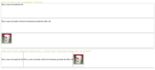
Initally, I was delighted to see that upon giving the div tag a display property of 'table-cell' it uses it implements like a valign tag. [click to enlarge]

image

But unfortunately, IE6 does not support this. For a detailed description on how browsers implement the display property, visit this page on quirksmode.

The previous article by Gavin Kistner offers two workarounds.

Method one works in the following way (I call it the Duck and Head-up method): assuming a fixed height for the inner content (im my example the img with class innerbox), position it absolutely inside the container (outerbox) with the top-edge at 50% of the outerbox height. Now move back the innerbox up by half its own height, by using margin-top:-y, (y=half of inner box height).

I haven't tried this, simply because in my case, the inner content does not have a fixed height.

The second may perhaps work because it assumes a single line of text inside the box (which a single inline image should be) and a fixed height for the outerbox, (which is true in my case), and then setting the line-height for the parent (outerbox) to the fixed-height. Let's see how that works. Sadly, it only works in the case of text. probably because it relates to font-size and not image-height [In the following example, text-height + above and below height = 140 which was the specified line-height]

image 
[In the above example, height declaration replaced by line-height declaration]

I came up with a workaround which included some additional mark-up. Add a non-breaking space (&nbsp;) before the image, set the font-size to 1px and increase the outer-box width a little;  that way the image is seen as a part of the running text and Mozilla and Safari render this correctly [look at the second box]. But as always IE6 refuses to implement it this way! Sigh.

image

Finally, this site seems to have find a solution using a font-height declaration for IE6 and then hiding it from other browsers. CSS vertical-align.

But clearly if you want an excess mark-up and hack free solution, tables are probably your only resort - at least for an image gallery.

Wednesday, February 20, 2008

Replacing 'cellpadding', 'cellspacing' and 'border' attributes for the table tag with CSS

I don't hate tables at all - unlike what pretty much all CSS proponents would have you do. They have their uses. What I don't like is adding cellpadding, cellspacing and border attributes in each table tag, making my mark-up look ugly and unreadable.
I recently found the really cool border-collapse CSS property, which seems to solve the issue. This post is just to fine-tune it and test it across browsers.

Unfortunately, inline style declarations (as in a <style></style> statement) seem to be unsupported by Blogger. So I guess I just have to have to paste screenshots.

FF 2.0.0.10

table_test_FF_2_0_0_10

IE 6

table_test_IE6

So, for a table with, say, class 'sample_table', this is what you need to do:

table.sample_table{border-collapse:collapse;} /*removes cellspacing and border*/
table.sample_table td{padding:0;} /*removes cellpadding*/

[just .sample_table will also work]

Thursday, November 29, 2007

Batch Process in Photoshop - Override JPEG Options Dialog Box

Batch processing in Photoshop can be a real time saver, but of course it's a sheer waste of effort if you have to press 'Ok' after each action is completed. Which is what happens if you are saving .jpg files, because a .jpg save action dialog box pops up.

jpeg_options 

I couldn't find an answer to this, until I did some googling and looked up Adobe Help. Here's how it works.

1. First off you need to include Save As and Close in your action. [Remember to use Save As and not Save, or else it would not work].

save_as_action

2. Next, when you are creating your Batch process, tick the Override Save As options checkbox. Voila! No more JPEG options.

batch_override

Thanks to: http://forums.macosxhints.com/archive/index.php/t-25180.html